API Technologies Web Graphics
API Technologies was in the midst of a transition from a group of disconnected websites to integration of separate sites into a single content management system. Previous site content had to be migrated with consistency and cohesion in mind
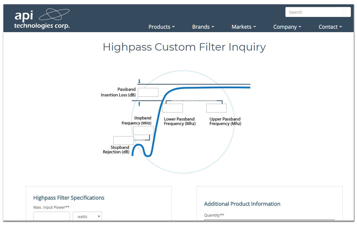
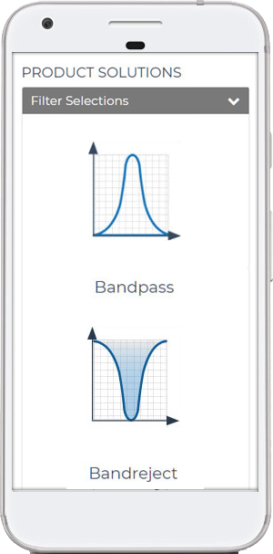
Some elements had to be redesigned to fit the new "look and feel" on the new site. The filter forms were the most heavily used user interface elements of the previous API Microwave site, next to the search box. The filter graphics had to be placed prominently on the new filter forms, increased in size, and adjusted to not display on mobile devices using Bootstrap 3.
The filter curve colors were changed to the 'action color' found throughout the rest of the new site design. They were enlarged for clarity, and to fit with the changed sizes of the input fields.
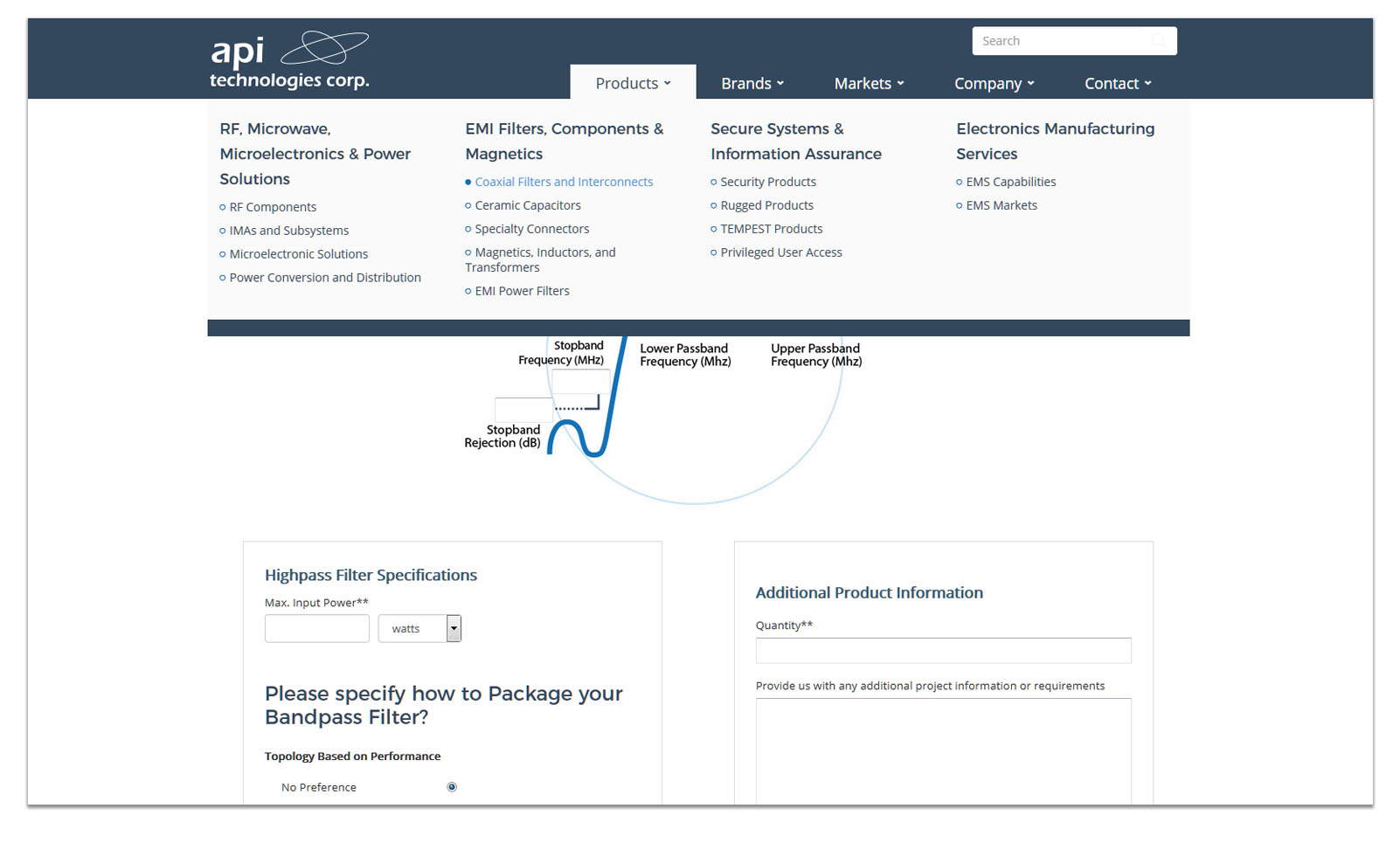
Changes were also made to the main navigation UI elements. In place of a static bulleted list for sub navigation elements, a hover class was used to activate a Font Awesome icon switch that mimics the visual sense of a bulleted list circle being colored.


